Brand Identity & Style Guide
The
Architecture
of a Brand.
We could have made it easy for ourselves. But then we would be like the others.
Wundertat was born out of anger. Anger at an industry that sells hours instead of results. That holds meetings where no one decides anything. That writes invoices listing 'project management' without explaining what that means.
When we founded our own agency, we knew: The foundation had to be massive. It must be so clear it requires no explanation. No round edges. No playful gradients that look insecure. No interchangeable stock photos.
The impossible we do immediately. Miracles take a little longer. This phrase is not marketing. It is the core. And the design must carry this phrase as if it were carved in stone.
Precision in
Symmetry.
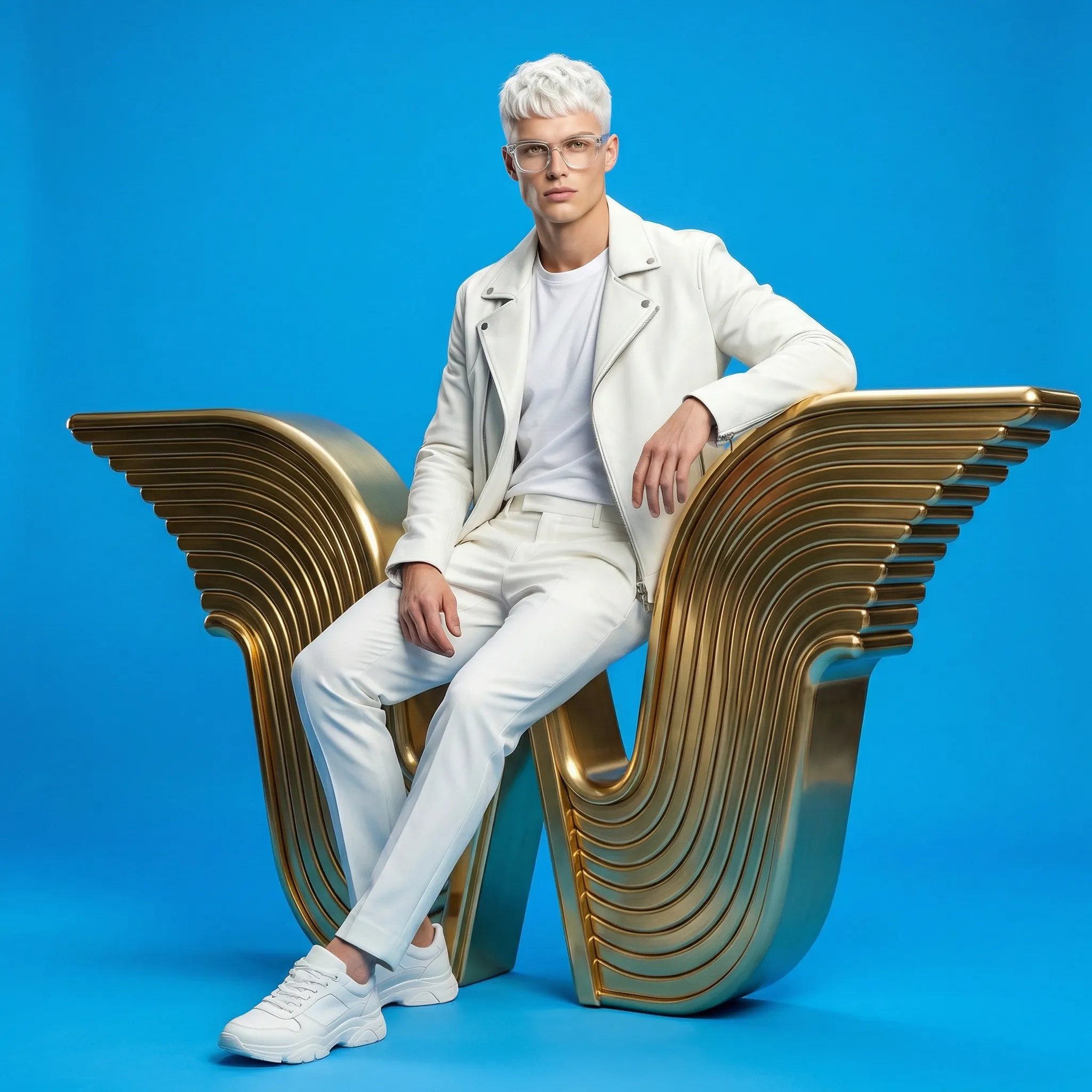
The W-emblem is not a letter. It is architecture. The wings of the emblem consists of precisely calculated, parallel grooves — inspired by massive, milled ship components or classic cooling elements in high-end audio.
No gradients in 2D. No rounded ends. The 3D logo (the 'Trophy') is solid, ribbed brass/gold on white marble.
Less. But extreme.
Midnight Obsidian
Our canvas. Deeper than pure black, with an immensely subtle blue tint for cinematic depth.
Pure White
Radiant. Mercilessly contrasting. Used for typography on Obsidian or as tactile white textures in photography.
Intense Sky-Blue
A strong, rich sky blue without compromise. Mainly staged for set design, physical photo backgrounds, and lacquers.
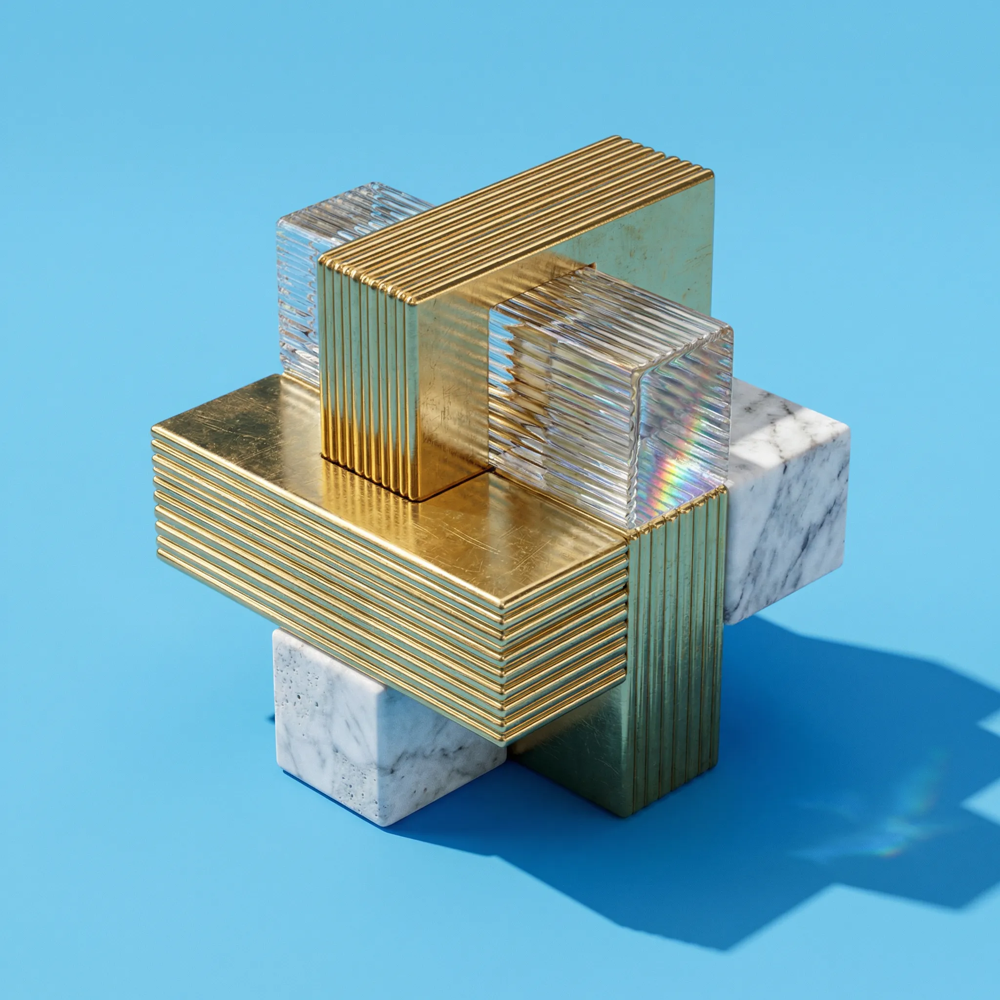
Ribbed Gold
Warm, heavy, architectural. Never a cheap web gradient. Always intended to be solid brass or gold highlight.
The voice needs
no megaphone.
PRIMARY HEADLINE / OGG, PLAYFAIR DISPLAY
Miracles work.
An elegant, literary serif font. It brings high fashion and editorial design to the digital world. For claims and big moments.
BODY & UI / INTER, HELVETICA NEUE
Clarity over complexity. Precision over poetry. When we explain something, we do it in a sans-serif font without distraction.
const precision = 100%;
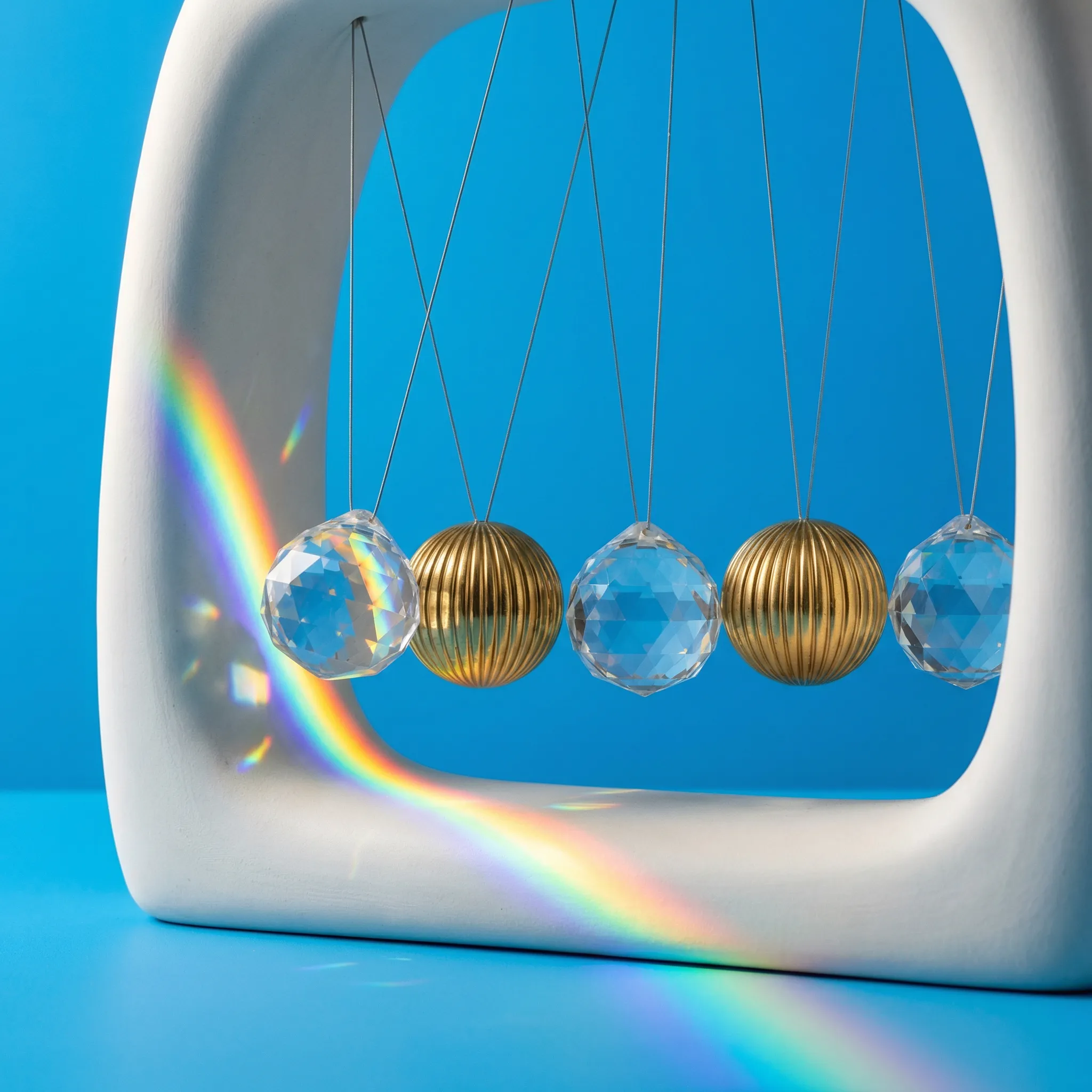
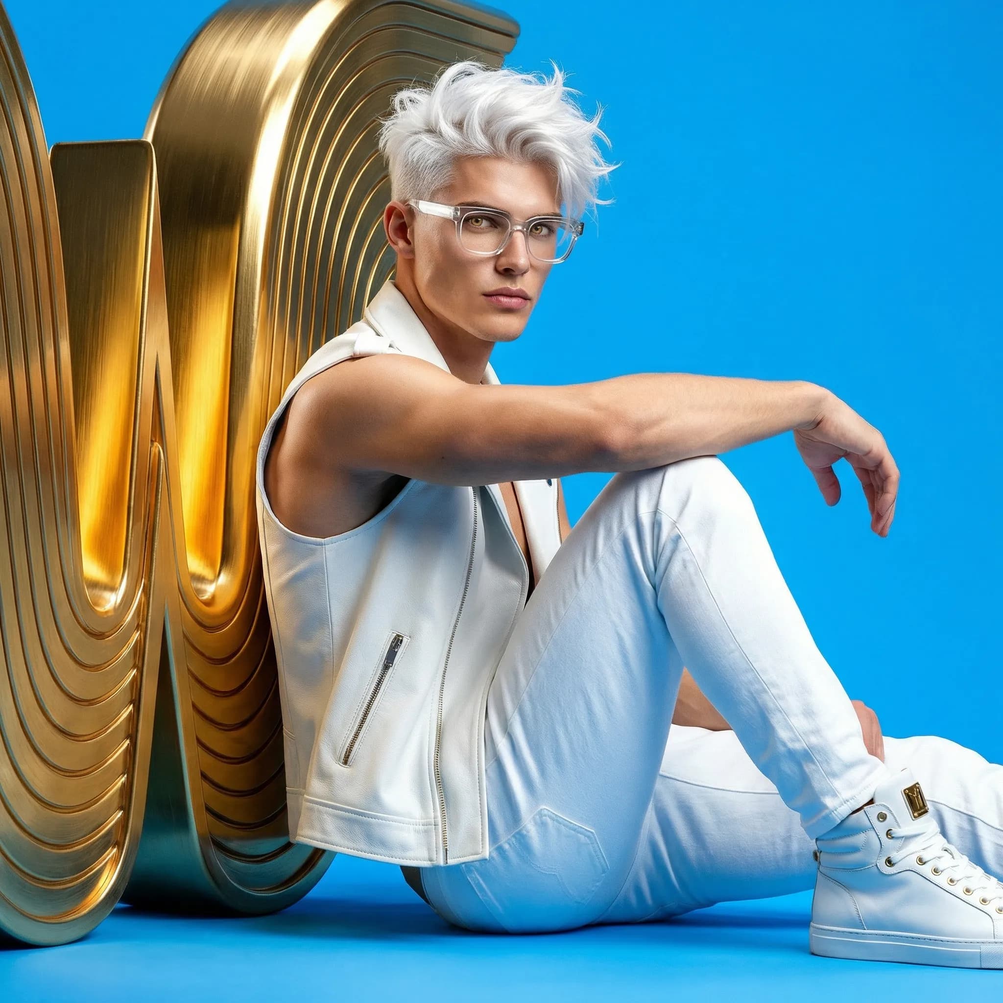
The Holy Trinity
No CGI perfection. Pores, scratches in the glass, heavy fabrics. Cinematic Studio Lighting. Raw Photography.
Solid Gold
Architectural depth through ribbed brass.
Optical Crystal
Physical light refraction and heavy glass prisms.
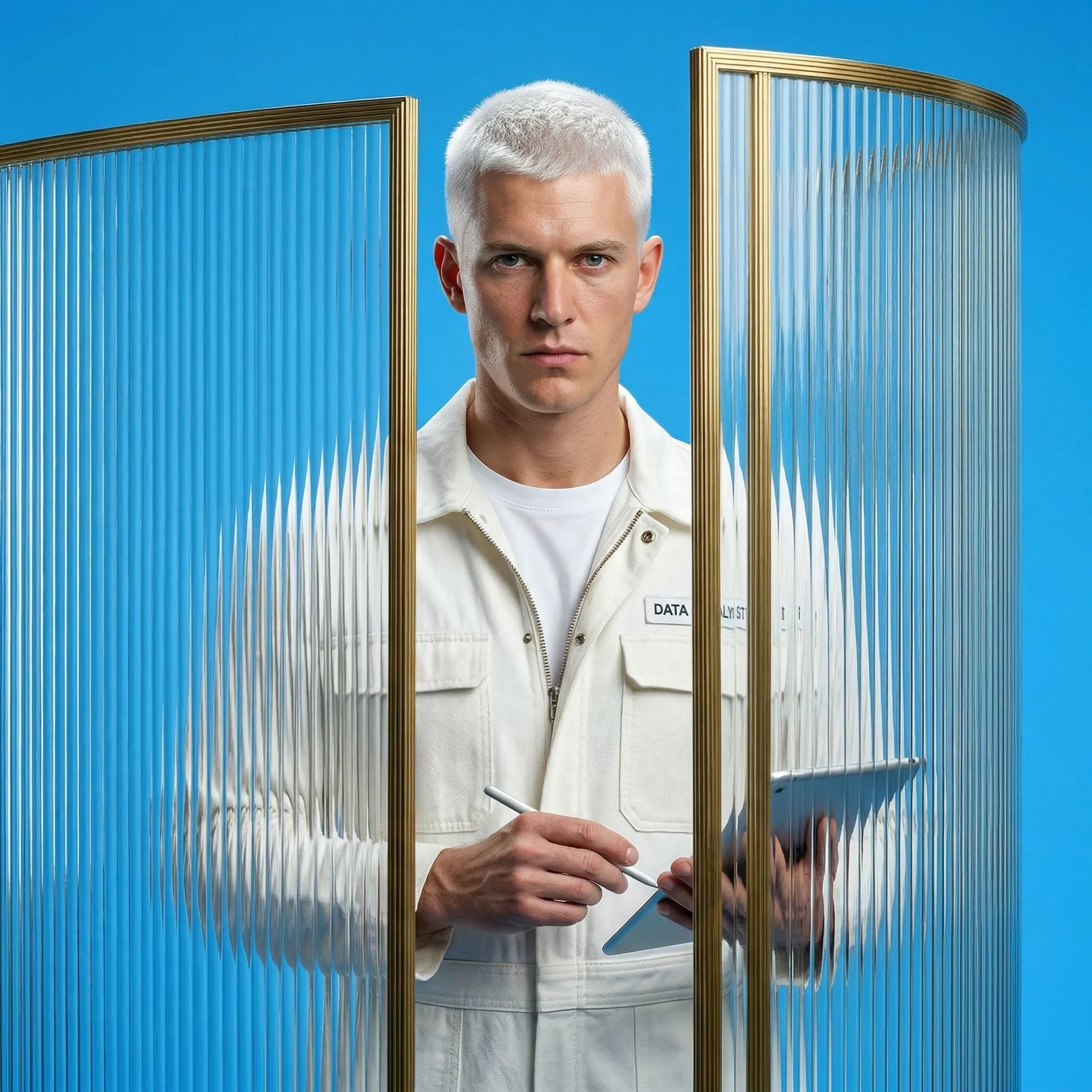
Raw Beauty
White textures, real skin pores studied deeply. No filter.
We talk little.
We do a lot.
The industry hides behind words like Synergy, Holistic and Disruptive. We banned these words. If you can't state the truth extremely simply, you haven't understood it.
"The website launches on Friday. It works."
Precise. Honest. No filler words. A period at the end of a sentence is the strongest statement.
"We create bespoke, holistic, digital ecosystems."
A website is not an ecosystem. It is a website. Call it that.
The impossible we do immediately.
Miracles take a little longer.