Corporate Identity & Strategy
The
Sandfox
Logic.
Where razor-sharp intuition meets relentless execution.
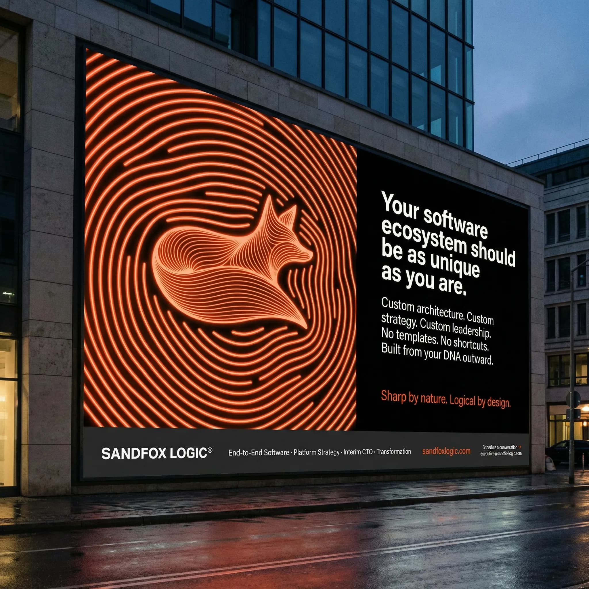
Sandfox Logic® exists at the intersection of technical innovation and commercial strategy. We act not just as developers, but as architects of complete end-to-end software ecosystems. We are executive-level strategic operators for companies that refuse to stand still.
Like the Sandfox, we anticipate the future of business. We read the room. We listen to the static. We process the complex variables of a company's transformation, and then—we move. Grounded, agile, and always in the moment.
Sharp by nature. Logical by design. This is our primary anchor, the foundation upon which everything else is built.
The fluid
wireframe.
The Sandfox logo is a fluid, topological wireframe. It represents data streams, topographic landscapes, and sound waves forming the sleek silhouette of a fox.
It embodies the concept of finding organic, elegant solutions through highly structured, logical frameworks.
Brutally effective digital contrast.
Logic Orange
Alertness, energy, construction, dawn. It is the color of action.
Absolute Black
Sophistication, depth, grounding, the premium void.
System White
Cleanliness, clarity, interface usability.
Beyond the core values, defined shades ensure interface hierarchy, depth, and accessibility compliance.
Base (500)
Deeper (600)
Darker (700)
Lighter (400)
Soft (300)
Highlight (100)
Base (900)
Elevated (800)
Surface (700)
Muted (600)
Border (500)
Soft (400)
Unapologetic Form.
Maximum Clarity.
We developed a distinct typographic identity built strictly on high-impact extended grotesks. The system balances aggressive black weights for statements with ultra-legible architectures for dense data environments.
93 Extended Black
SANDFOX
LOGIC
Typeface Exploration Board
Primary Headlines
Neue Haas Grotesk Display
95 Black
Impact Displays
Sztos
Extra Bold
Action Modules
Benzin
Extra Bold
System Data
Akzidenz-Grotesk W1G
Extended Bold
Body Text Engineering
Engineered for Deep Reading.
A brand isn't just headlines. It's how comfortably a user can consume dense technical documentation and complex corporate audits. We meticulously tuned paragraph spacing, contrast ratios, and typographic rhythms.
Every pixel is an unmistakable statement. We ran through countless iterations to ensure the typography is not only aesthetically dominant but uncompromisingly powerful on a functional level. The information architecture is designed so the human eye is guided perfectly through cognitive layers.
The incredibly resilient fox jumps effortlessly over the lazy dog. 0123456789. The quick brown fox jumps over the lazy dog. The interplay between extreme blackness in the headlines and razor-sharp clarity in the body copy creates the calm authority that Sandfox Logic wields effortlessly.
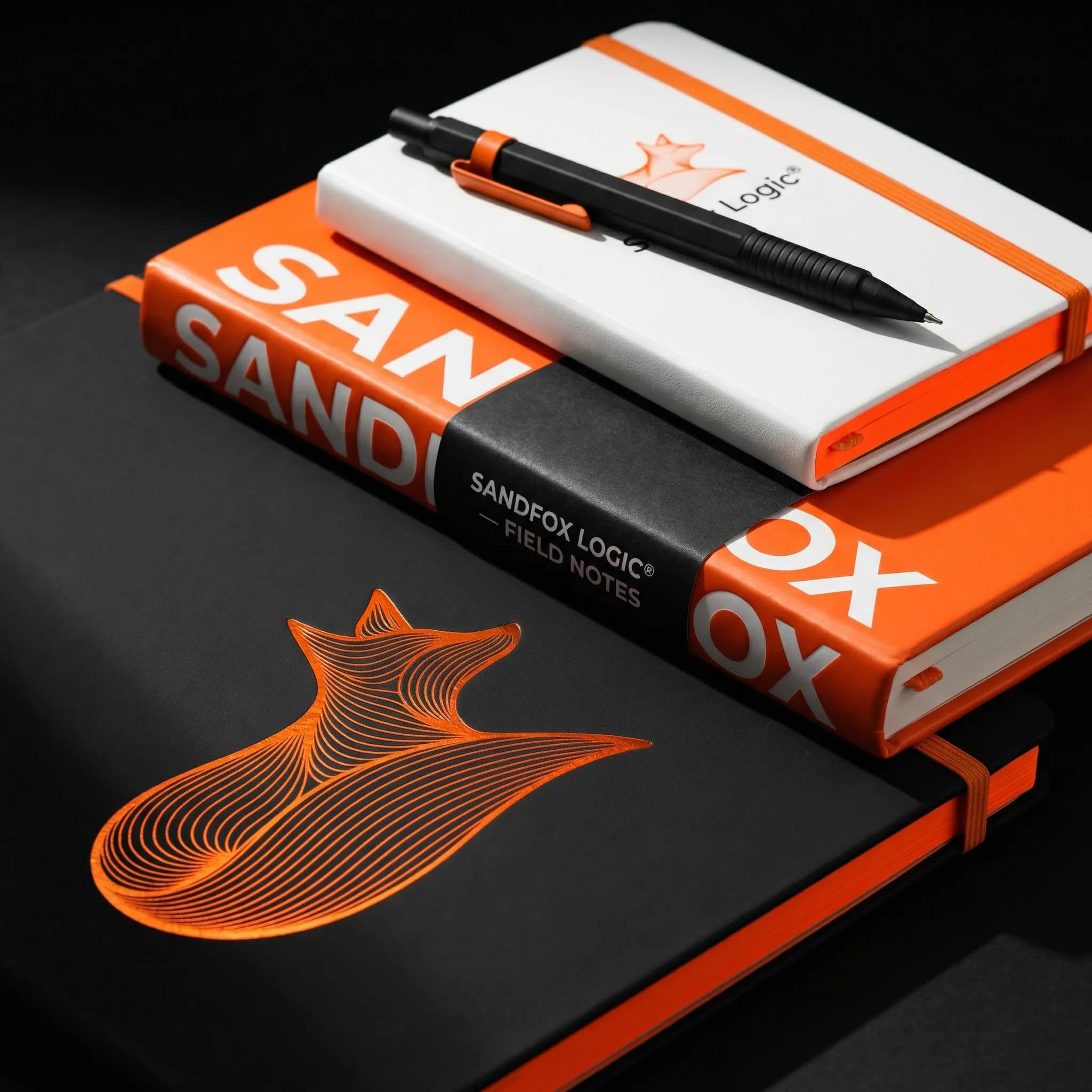
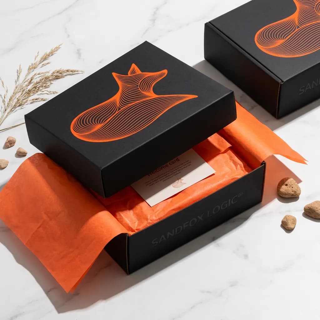
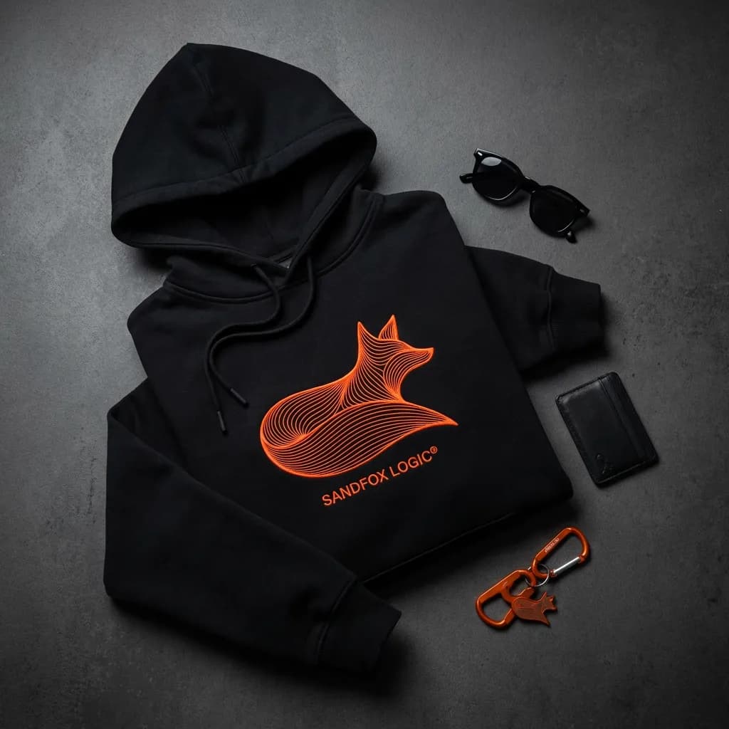
Tangible Assets
Product design in a class of its own. From uncompromisingly embroidered hoodies to flawless leather wallets – every physical object speaks the strict Sandfox design language.

Uncompromising
Perfection.
How we set new industry standards for Sandfox Logic.
This was no simple branding project. It was a visual and strategic open-heart surgery. We completely restructured the corporate identity from the ground up, proving precisely why our work is so outstanding.
Every color, every pixel, and every material was honed through thousands of iterations. We didn't settle for 'good enough'. We deconstructed and rebuilt until an absolutely indestructible framework emerged, making the cold authority of Sandfox palpable in every fraction of a second.
"We don't talk. We inform."
Not just the design, but the language too was radically streamlined. No marketing bullshit. No empty promises. The language of Sandfox Logic is like a line of code: efficient, binary, and absolutely reliable.
Scalable Ecosystems
From grand architectural scale to intimate material touchpoints, the identity maintains absolute coherence.
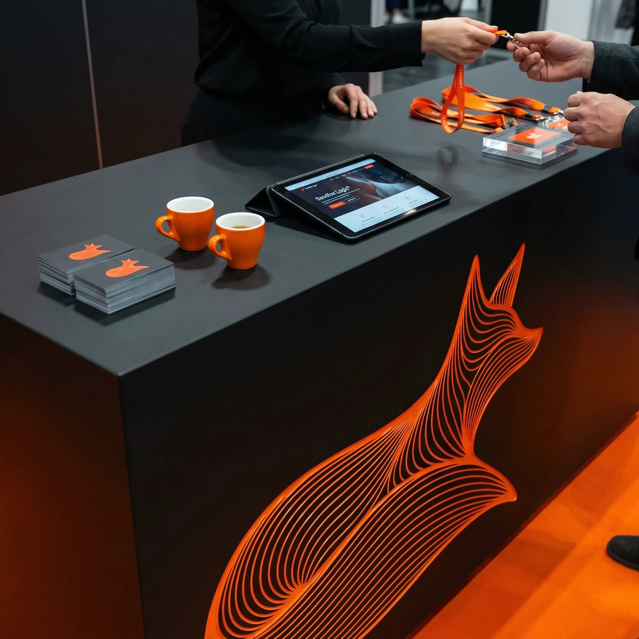
Corporate Headquarters
The direct first contact. The physical brand experience begins at the reception, where cool, calculated materials radiate an aura of absolute competence.
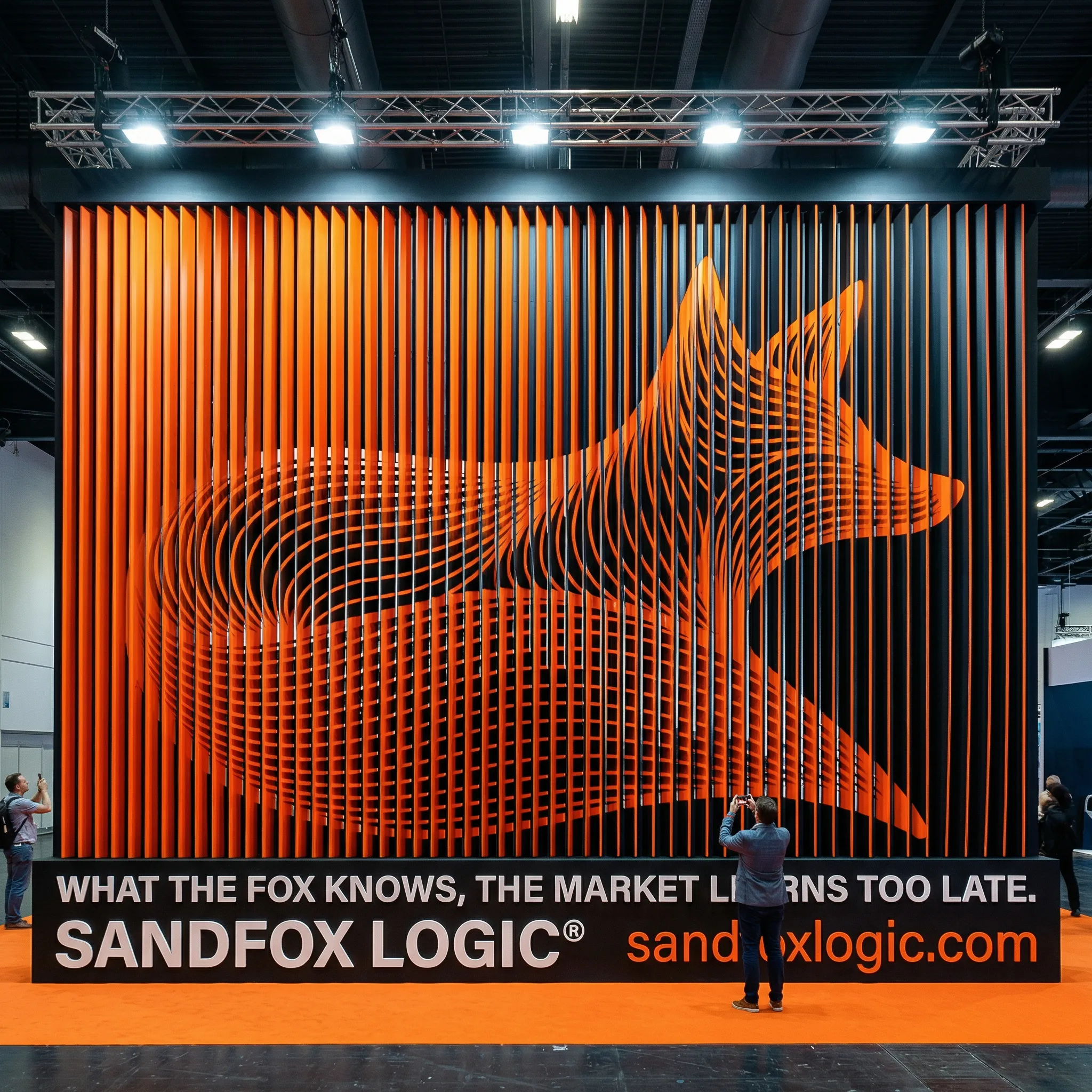
Monumental Presence
Whether as a massive 3D sculpture at international trade shows or branding on gigantic construction cranes – the iconic wordmark commands respect at any scale.
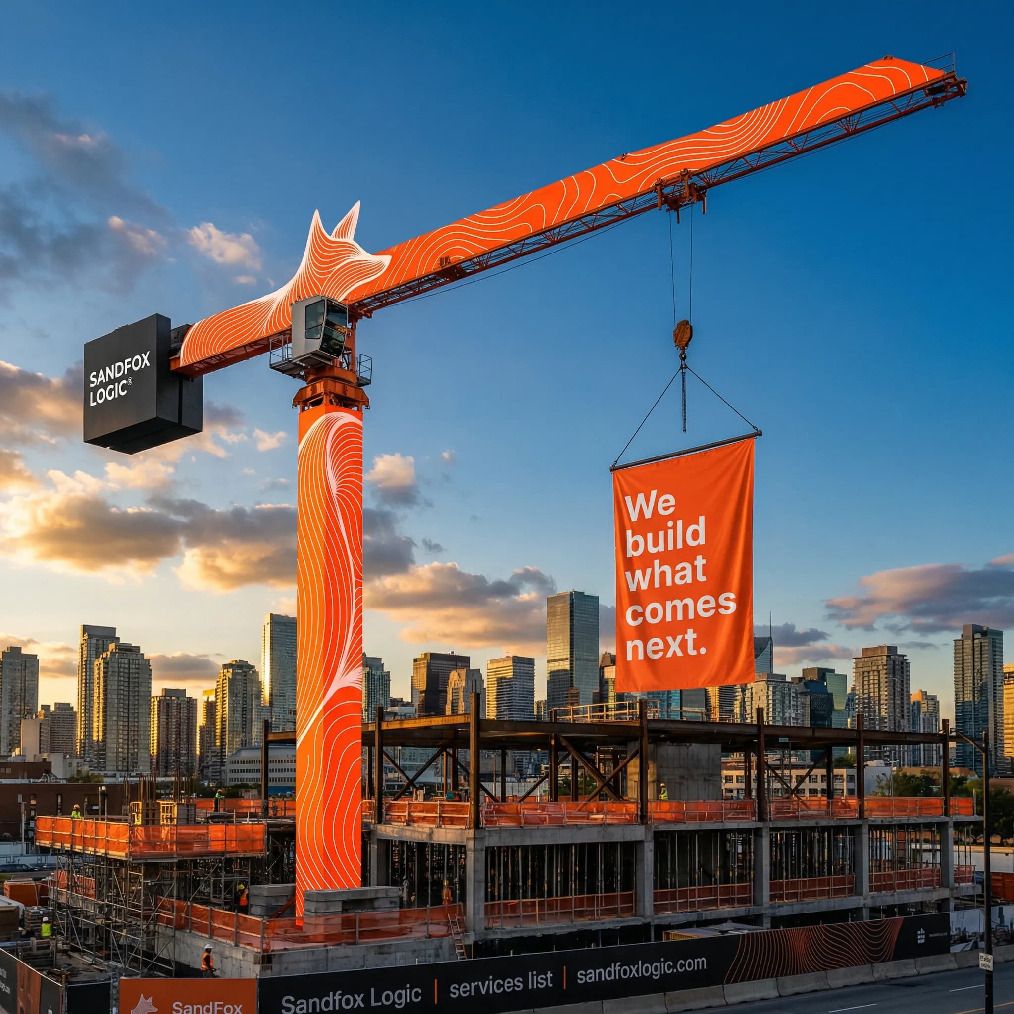
Super-large scale Branding // High Contrast Industrial Yellow & Pure Black
Halo-Lit Dimensional Letters // Pure White & Deep Black in Transit Hubs
6-Meter 3D Corporate Installation // Matte Black & Vibrant Orange Edge Lighting
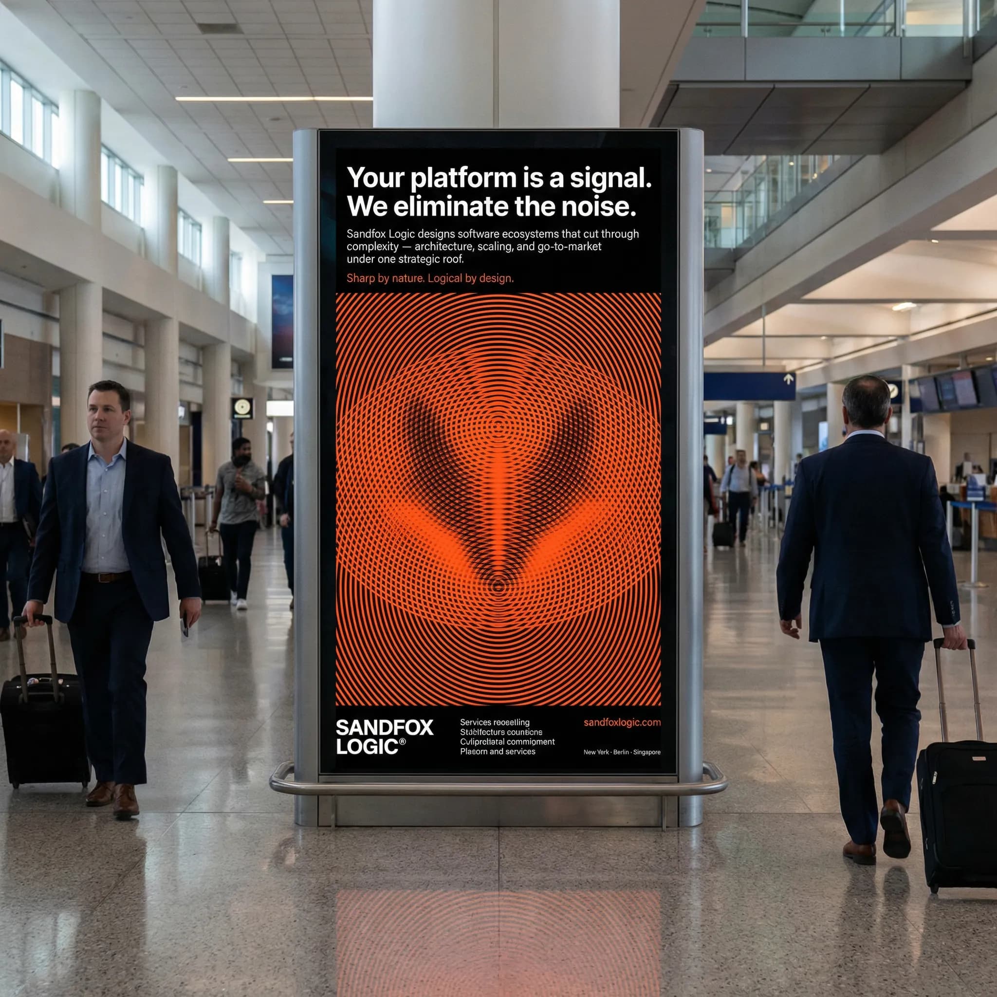
Global Transit & Logistics
Omnipresent visibility at the world's intersections. From industrial airport baggage carousels to monolithic billboard campaigns.
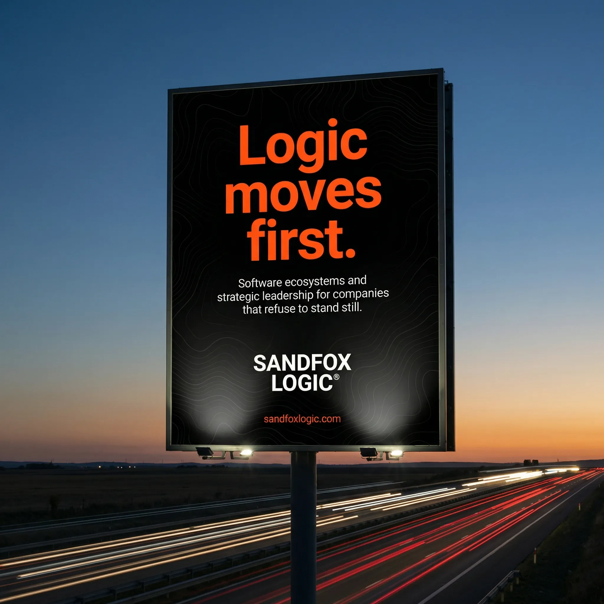
Monolithic Landscape Billboard Campaign // Forward-Thinking Strategic Movement
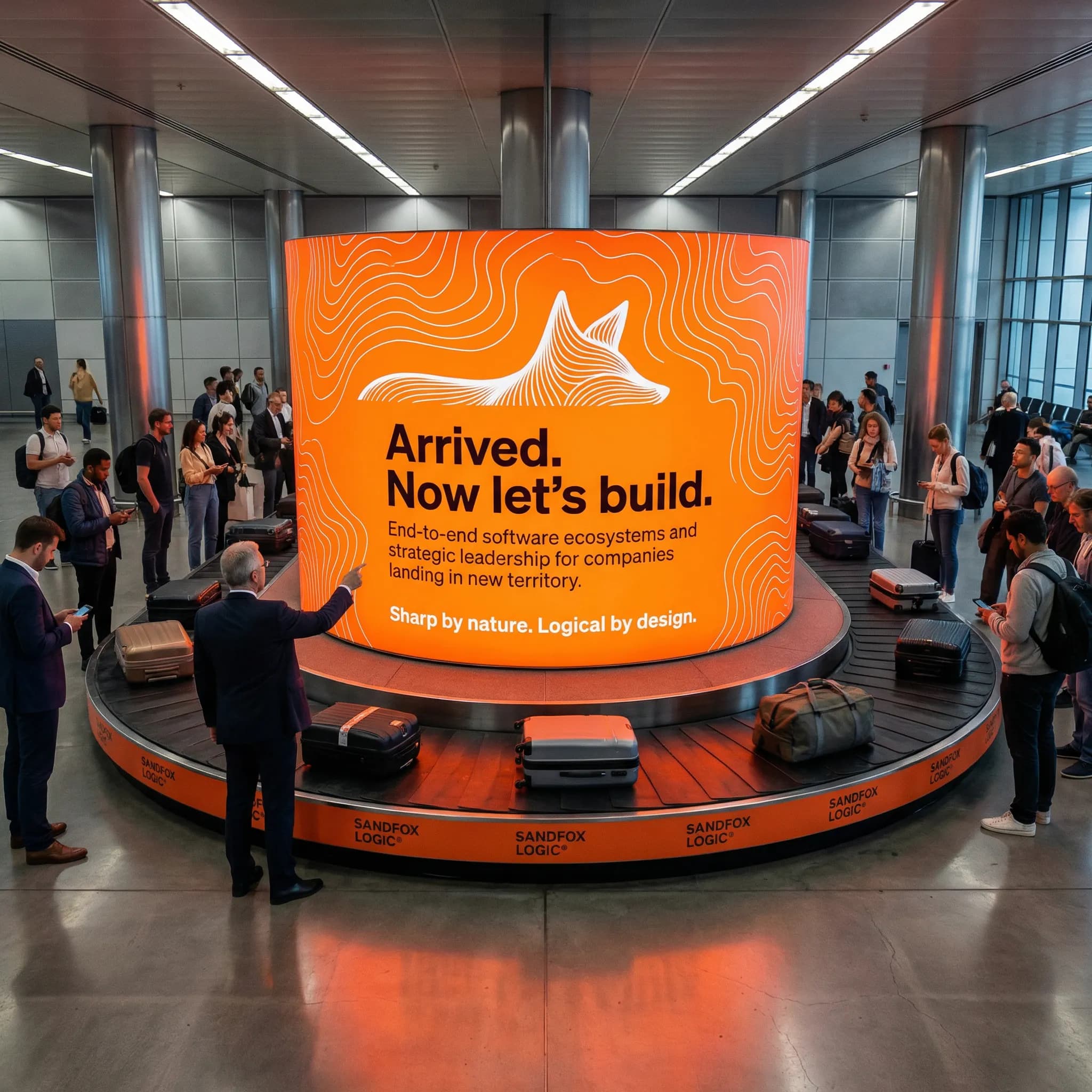
Airport Transit Infrastructure // High-Visibility Brushed Steel & Monochrome
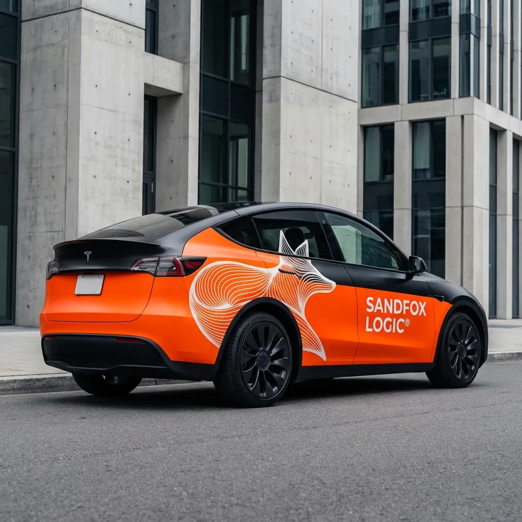
Fleet & Mobility
Consistent, unified vehicle branding for Tesla fleets – clinically clean, deep black, and instantly identifiable as 'Sandfox Logic'.
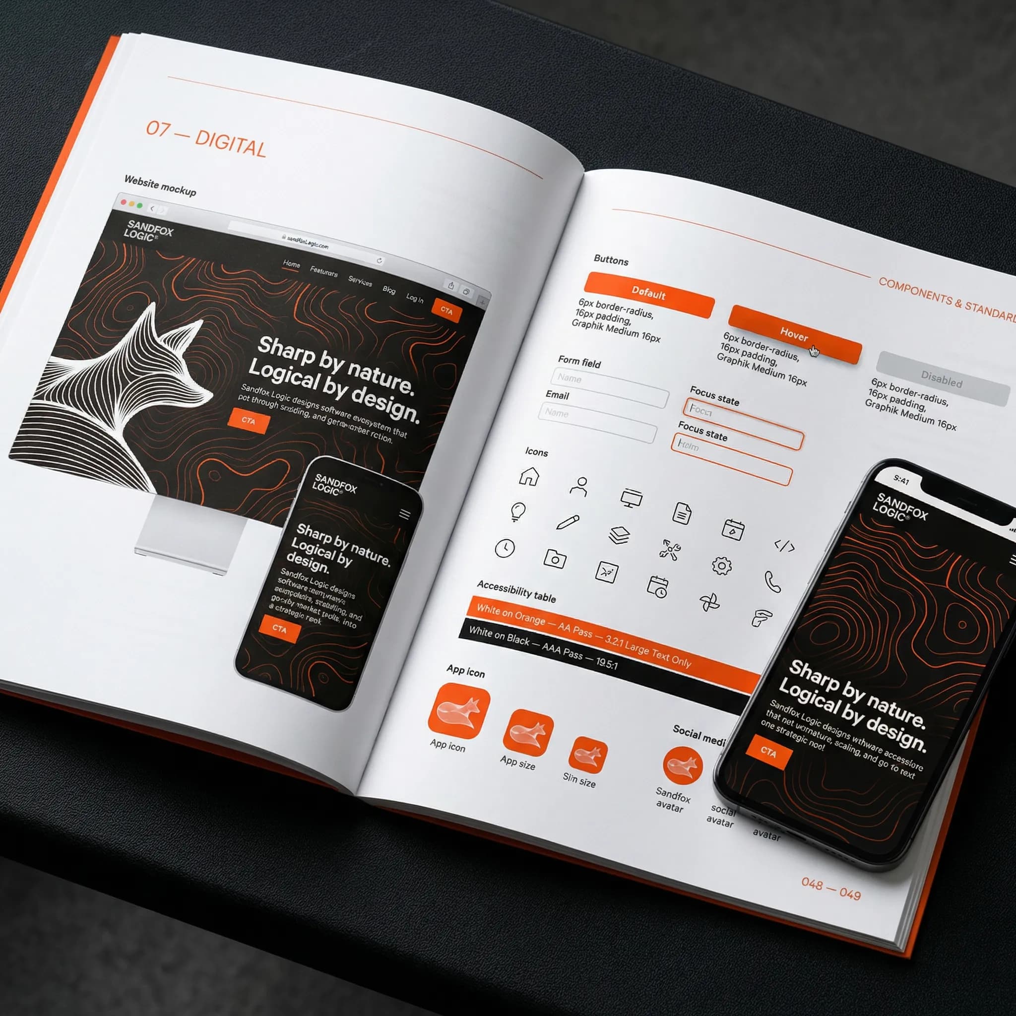
The Source Code
Every detail mathematically defined. No room for interpretation.
Direct &
Unapologetic.
Our voice is confident, highly intelligent, slightly wry, and completely devoid of corporate fluff. We speak like a trusted advisor who has seen it all and knows exactly what to do next. We are bold enough to challenge the status quo, but sensitive enough to guide our partners through it. We use active verbs: we don't 'strive to provide'; we build.
"Arrived. Now let's build."
Short sentences. High impact. Witty but professional.
"FOX SAKE, BUILD IT RIGHT THE FIRST TIME."
No vaporware. Just solid, scalable reality.
Decrypted Statement //
"I needed to build a completely new company from the ground up, and I didn't want a mood board. What Wundertat delivered was a reality check. They stripped away the industry noise and poured a foundation that demands immediate respect. No compromises. Just absolute, brutal clarity."
Fabian Fuchs
Founder, Sandfox Logic®
Arrived.
Now let's build.
Sharp by nature. Logical by design.